Missioncmdr
New member
- Joined
- Mar 21, 2008
- Messages
- 538
- Reaction score
- 2
- Points
- 0
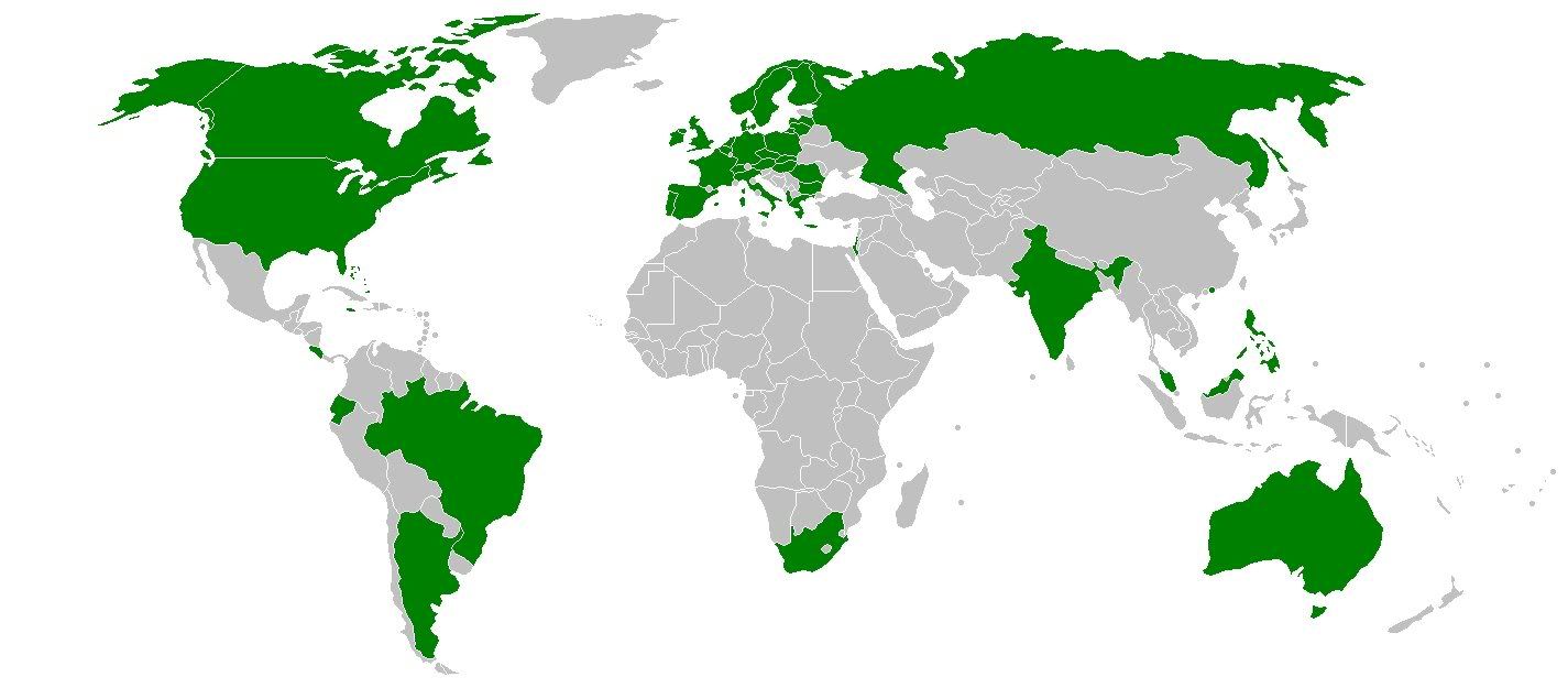
One thing I find interesting about the Orbiter community is how we have members from many parts of the world. I thought it would be a neat idea to have a visual representation of that, so I made this. The map was obtained off of Wikipedia. A country is colored green if there has been a member from there that has made at least one post.
Last edited:

 :lol:
:lol: