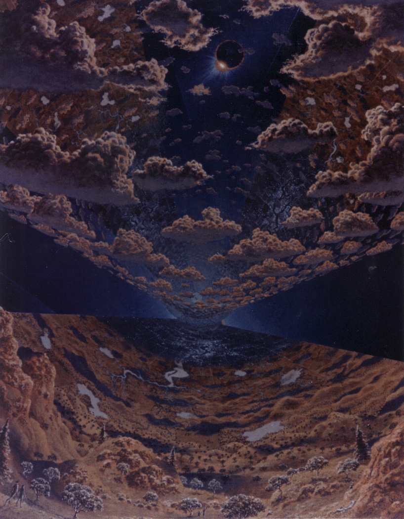
I love this old style...
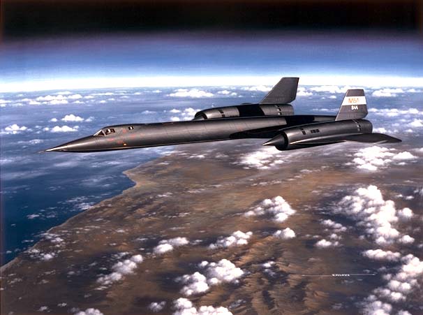
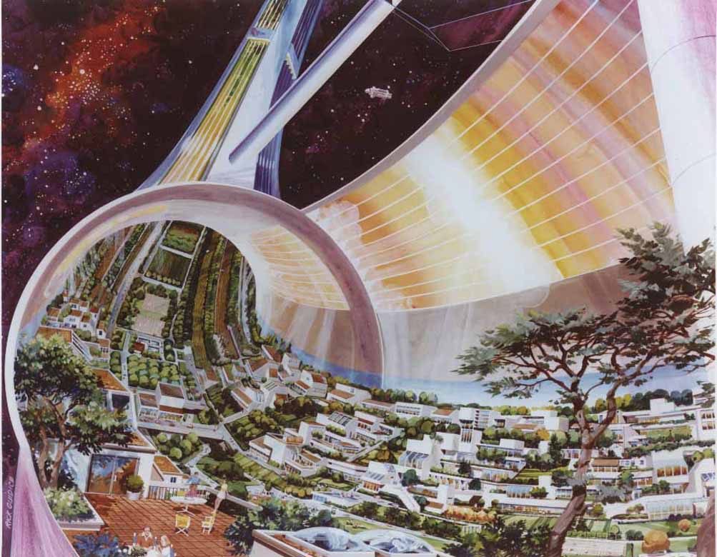
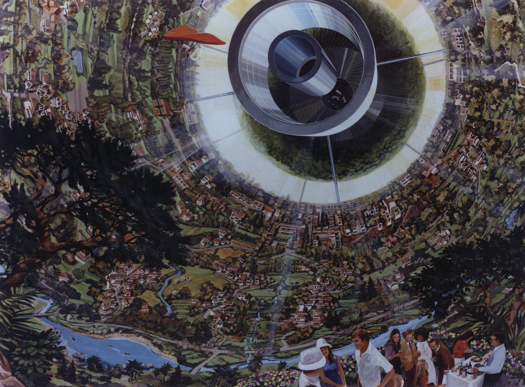
real artwork. It really conveys a sense of emotion and awe, motion, surreal possibility, and excitement. This is the kind of stuff that gave me inspiration and wonder in spaceflight when I was really young.
The modern, CGI stuff is really boring and dead, it invokes none of that. It has no life in it, and is less interesting than a scientific diagram. No wonder there isn't the interest and fervor with spaceflight that there was in the 60s, and even till the 80s.
I mean, here is Orion docked to the ISS. Look how boring and dead this image is:
And Dragon being berthed with the SSRMS:
There's supposed to be motion, but the image... looks like a still life at 7.5 km/s. Oh well...

Granted, NASA is certainly trying, with stuff like their Armageddon-ripoff poster, but I think they need to be more inspiring than a cool-looking poster with shuttle crews looking as 'serious' as possible... :uhh:
Maybe it's just that spaceflight artwork is boring these days, because these days, spaceflight itself is boring.
I personally think that the "space colony era" was some strange outgrowth of flower-power idyllic world-building or something. They were looking for new ground away from the nastiness of political corruption. And it seems the artwork of the day glossed over all the nitty-gritty engineering details and was 100% conceptual.
I don't think it was about flower-power at all- the artwork may have been a bit idyllic, but the whole concept was an infrastructure of economy in cislunar space. The colonies, were supposed to support engineers and workers that would build, operate, and maintain solar power satellites, that would provide power the growing needs back home.
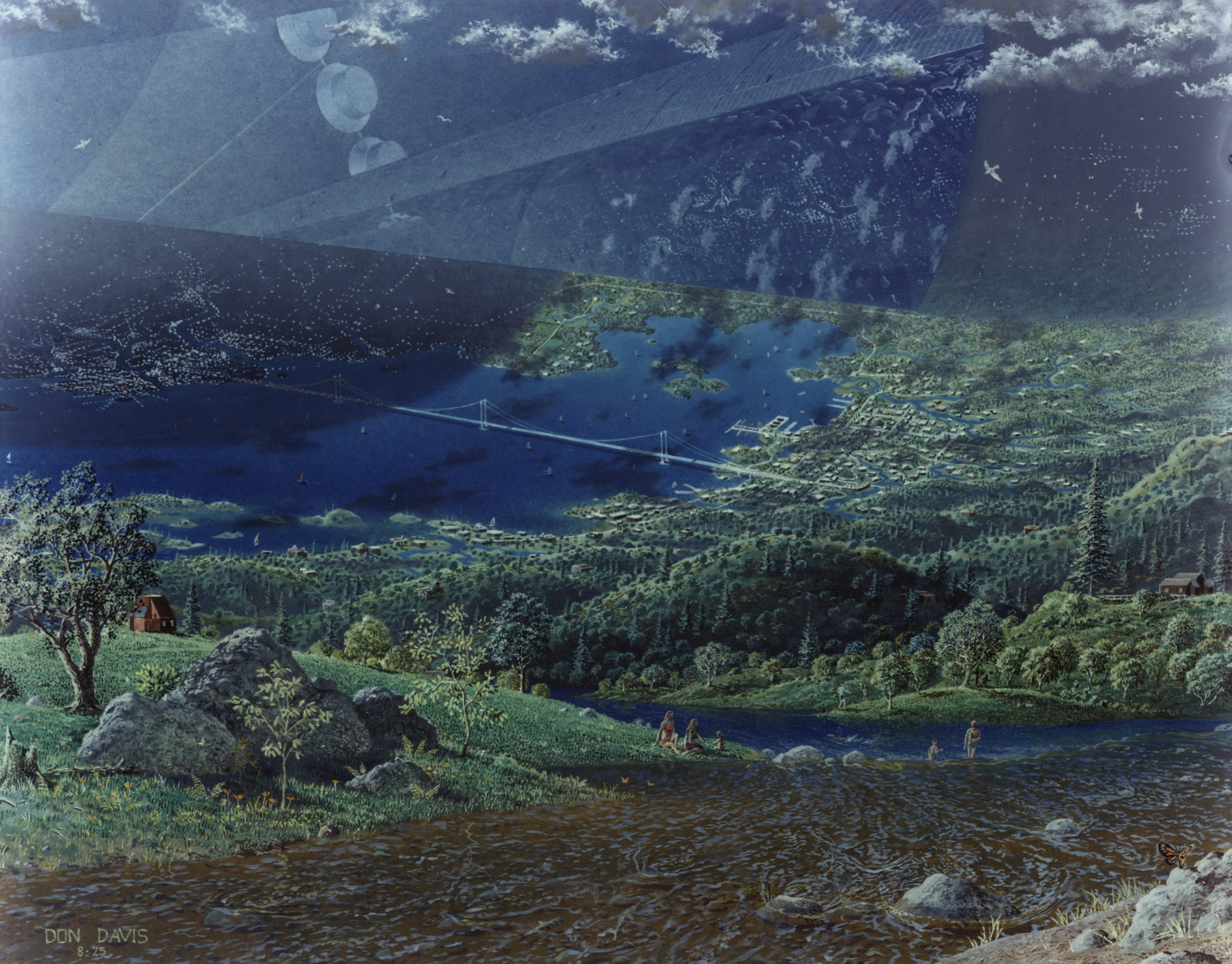
And there were serious studies done. Both the Stanford Torus and the O'Neill cylinder were serious designs, not flim-flam concepts. You can find out more about the science behind the Stanford Torus
here. Of course the real nitty-gritty technical stuff was not dealt with much, but the basic concepts are not nonsense.
By the way, doesn't this O'Neil Cylinder looks spooky or diseased
Yeah, that is because it has (for some inexplicable reason) had the contrast turned down, it should look like this:
All of this stuff was dreamed up in the early days of the Shuttle program, where launches were predicted every few weeks. Challenger put an end to that delusion and the Shuttle program was permanently scaled back to a few launches a year.
I'm pretty sure they figured out before Challenger that their launch rates were absurd. :dry: